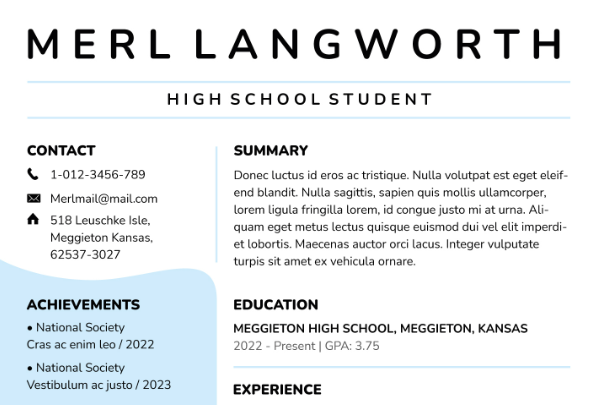
Perfect Font for Resume
Perfect Font for Resume. In the world of resume creation, selecting the ideal font can be quite the conundrum. The font and size you choose play a crucial role in making that all-important first impression on your potential employer. A font that is both simple and legible can set the stage for showcasing your professionalism and accentuating your wealth of experience and skills.
In this comprehensive guide, we will delve into the realm of fonts and sizes, equipping you with the knowledge to pick the perfect one for your resume.
What Constitutes the Best Fonts for a Resume?
With a plethora of fonts at your disposal, deciding on the right one for your resume can indeed be a daunting task. While it might be tempting to choose a font that reflects your personality, it's vital to remember that recruiters might not share your font enthusiasm. Opting for a font that challenges their reading capabilities is a risk not worth taking.
It's worth noting that many employers utilize applicant tracking systems (ATS) to manage and filter job applications. These systems don't always play nice with intricate fonts, often translating them into enigmatic symbols or, worse, empty boxes.
The Best Fonts for Your Resume
If you're crafting a resume for a creative field such as graphic design or advertising, you do have more wiggle room in terms of style. However, even in these creative domains, readability remains paramount. Below is a curated list of the best fonts for resumes:
- Arial
- Avenir Next
- Calibri
- Cambria
- Didot
- Garamond
- Georgia
- Helvetica
- Muna
- Times New Roman
Selecting the Right Resume Font and Size
Choosing the perfect font and size for your resume can be a make-or-break decision. Here are some indispensable tips to guide you:
Opt for Professional and Readable Fonts
Complex fonts can turn your resume into an unfathomable puzzle, discouraging potential employers from giving it the attention it deserves. Instead, lean towards a clean, straightforward font that renders your words crystal clear.
In the world of fonts, you'll encounter two main categories: Serif and Sans Serif. Serif fonts come with those little "tails," while Sans Serif fonts don't. For resumes, Sans Serif fonts are generally the way to go due to their exceptional readability.
Certain Serif fonts, however, still retain their place as acceptable choices for a professional and simple look. Among them, you'll find Cambria, Garamond, Times New Roman, and Didot. Always prioritize readability when selecting a font, as the right font ensures that a hiring manager can seamlessly navigate your application.
Steer clear of "thin" or "light" fonts, as they can be a strain on the eyes when viewed on a screen.
Pinpoint the Ideal Resume Font Size
The optimal font size for your resume typically falls between 10 and 12 points. The size you settle on should harmonize with your overall resume layout. A one-page resume is fitting for recent graduates or newcomers to a field.
For individuals with extensive experience or a variety of roles, spanning two pages may be necessary. In such cases, start with a font size of 10 points and consider scaling up if space permits.
While the allure of cramming everything onto one page can be tempting, resist the urge to dip below a 10-point font size. Doing so can strain your reader's eyes. If your resume extends beyond a single page in a 10-point font, edit your content judiciously, trimming unnecessary words and phrases. Retain only the most relevant content that effectively showcases your skills and experiences relevant to the job.
Emphasize Key Sections
You can inject a dash of personality and clarity into your resume by playing with font styles for your name and section headers. Consider options like bolding, underlining, or italicizing. However, remember that your entire resume should maintain a consistent font.
Limit your stylistic choices to one or two to preserve the professional and legible appearance of your resume. Here's an example of a resume segment that effectively uses bold font for added clarity and style:
Professional Summary
Conscientious counselor with over 3 years of experience, dedicated to meeting the needs of children, students, and parents. Creates customized plans to foster educational and emotional growth in a welcoming environment.
Seek Constructive Feedback
After you've settled on your font, fine-tuned your formatting, and meticulously refined your resume, it's time for a thorough review. Keep in mind that employers may print out your resume for sharing with colleagues or reviewing during interviews. Printing a test copy of your resume ensures that the font remains legible and the formatting doesn't go awry. This also allows you to verify that the margins and alignment adhere to expectations without cutting off any content.
Enlist trusted friends or colleagues to review both digital and printed versions of your resume for feedback. The realm of font selection offers various choices, but simplicity should always be your guiding principle.
A clean and legible font communicates professionalism, a trait highly regarded by potential employers.
In conclusion, while choosing the best font and size for your resume may seem like a small detail, it can significantly impact your job application's success. Opt for a font that balances style and readability, and ensure that your resume layout and font size create a harmonious presentation. Bold key sections to draw attention, and seek feedback to fine-tune your document. Remember, your resume is often the first impression you make, so make it a memorable one with the perfect font and size.


Post a Comment